Apple Park Caffè app
iOS app created to help people quickly order perfect lunch at Apple Park
WWDC episode about Caffe app
Role: Product Designer
Time frame: 10 months
Deliverables:
UX flow & Wireframes
Interaction design
User interface
User testing
Problem
A lot of visitors and guests use kiosks (public devices, iPads) to place an order, most of them use it for the first time. Ordering process isn’t so simple, so guests have a lot of questions, it makes waiting time in lines to kiosk longer, guests are annoyed by the process and front of the house team has to help to guests.
To make placing order process smoother and faster, unload the Caffe team and reduce the number of front of house people, I needed to redesign kiosk experience.
Users and User Journey
Kiosk can be used by any person inside Caffe. It can be Apple Park visitor, guest, apple employee. So the application should extremely accessible.
Kiosk user journey starts from a line to the kiosk.

Research
Main key-finding from business reports:
97% of customers buy their food from “main categories” subsections;
63% of people checkout with one item in the cart;
Key-findings from interviews with customers:
No map of cafeteria, guests don’t know where to pick up an order
No information about allergens
What if guests don’t have Apple Pay?
I also kept in mind that:
Some visitors see menu first time
iPad is attached to the desk, user can’t take it to reduce the distance
Noisy and crowded around
Some people know what they want (examples: fish, vegetarian, dessert)
Some people come to caffe without any particular wishes
Goals
Caffe guest can make a choice in less than 2 min (browsing experience)
Caffe guest can checkout in 30 seconds (checkout experience)
User should receive information where to find a station
Improve level of accessibility in the app
Improving browsing experience
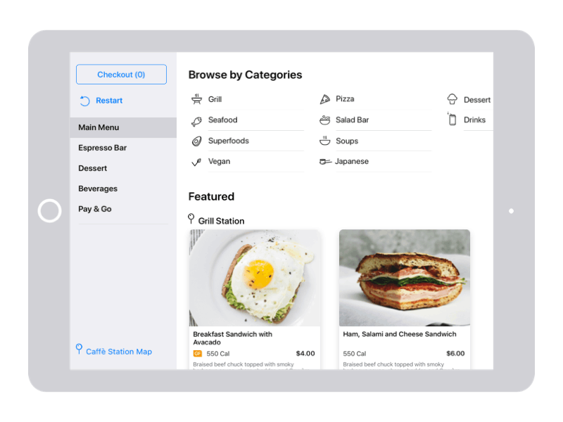
To improve browsing experience I spent some time with Caffe team and cleared up list of categories. Together with researcher we interviewed people to understand: what is important for people when they are selecting their lunch? When content was ready to work with, I started iterating on possible options to make categories easy to explore.
Exploring navigation options
These were options we tested with users. Research insights:
People prefer to see food options right on landing page, without thinking what category they have to select, some people select dish from first page just to save time;
~ 30% people had hard time finding categories, when they were located in the dropdown
With all subcategories listed on landing page, users could quickly navigate to desired section, just in one click
In new design I reorganized structure of the menu. We introduced subcategories, so customers could see less options, they aren’t interested in. It helped them easier to make choice. Customers can always change main category after they’ve selected main dish (most common case: main dish + beverage/coffee). Added name of the station where user will need to pick up the order, applied proper structure for the headers to keep layout easy scannable by customers.
From business perspective, now all stations (categories) are equally represented on a menu. With this structure it will be easy to scale menu and adjust it to more categories.
Checkout experience
The average customer spent more than a minute paying for the order (counting from the moment user adds an item to the cart). My task was to change the interaction and streamline this process. As most of our customers buy only one main dish, I focused on this use case.
Steps in the old checkout process:
Select dish → available customization options → update them → close customizations → navigate to cart → fill out the information (like a name) → select payment options → pay → confirmation screen - 9 steps
And all customers wanted was - choose a dish and pay for the order - 2 steps
Exploring options
I started from exploring options, combined customizations with main descriptions and explored different interactions to make experience smoother. I kept my mockups on a right levels of details, so customers I introduced design could give me useful feedback.
Option with the cart represented in slide out
2. Guiding user to checkout, right after adding item to the cart

I tested both options, and the second option showed much better results with the new users. People didn’t spend time to find the checkout button; animation caught their attention. The first option also showed big interaction problems, as users could accidentally close side panel by the unintentionally touching area outside the panel while holding an iPad.
Directions for the user to pick up lunch
Observing users I saw how they struggle with finding station location after placing an order, so I added a map after checkout, so user could find station to pick up lunch.
After
Before

Implemented checkout
Improvements
The implemented design allowed users to go to checkout right after adding items to the cart without any extra steps.
We made the app 🤓smarter; now, it doesn’t ask personal information from people with vouchers and request receipt after placing order. It saves time to our users 🥳
With clear indication of how to pack the order: to go vs. here, user can always easy choose an option.
User can change number of items in the cart without leaving it;
Added waiting for time information on the item details screen; In case user doesn’t have time to wait salad for 20 min ⏱
Caffe app for everyone
Process of placing order should be accessible for every person in Apple Park. We added support of voice over, together with content designer we fixed all labels issues and I provided to dev team right order of elements on the screen for voice over feature.
As public device, users can’t switch to high contrast feature. Contrast ratio and text size should be optimal for users needs, so you can see that headers are bigger and bolder, body text is also bigger than default on iOS.
Results
Twice more people could checkout in less than 20 sec ⏱
Map helps users to find a station - great positive feedbacks from users 🥳
Now to find a cup of coffee ☕️ is not a problem
Front of house people confirmed that fewer people ask them questions about the menu and the next steps after ordering. ⏱

Visual elements
As UI/UX designer on this project I worked on iconography and some visual improvements

