IBM Aria
IBM Web application, created to help users efficiently analyze and fix machine learning model issues, to process documents.
Time-frame: 8 months
December 2019 - July 2020
My role: Product designer
Deliverables:
Concept story and user journey map
UX flow & wireframes
Interaction design
Visual design based on Carbon design system
Iconography
Product
Most information is hidden in paper documents. To use this information effectively, the organization has to digitize this information and to save it in the way, so other applications will be able to use it. Product Aria is an enterprise web application to extract data from paper and digital documents. It can classify and separate multi-page documents and extract specific data, so some processes could be automated, like paying invoices or approving loan application.

Problem
There is no easy way for people to check if an ML model has extracted incorrect data, missed some bits and pieces of required data, or if wrong automated processes will be triggered.
Persona
Operator Buffy is a task worker. Everyday she scans documents and reviews extracted data. She uses apps like Excel to preview extracted data and compare it with a document image.
Foundational Research
Research goal: Understand the work environment and current goals of an operator.
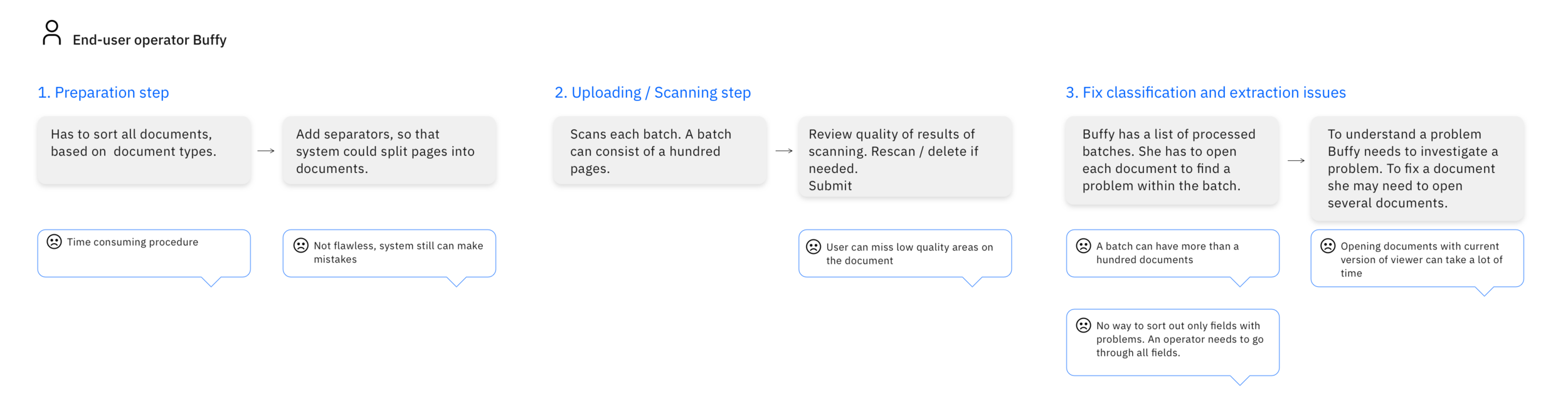
Together with the researcher, we conducted a series of interviews with people who scan and review documents on a daily basis. Based on our interviews, I put together a short AS-IS flow, which helped us better understand users’ problems.
As-Is flow
Research findings

Time is key
The goal is to fix as many errors as possible; currently, it's a very time-consuming process;

Accuracy
Mistakes in the data can affect document processing, but for the operator, it’s easy to miss an error; Any extra information about why the system couldn’t recognize data or documents is helpful;

Volume
Users can process hundreds of thousands of documents per day: emails, faxes, invoices.
Goal
Our goal for the MVP version was to create a simple process of quickly fixing issues, so the users will spend a minimum of time on each document and interact with the app without any how-to tutorials.
Concept Story
After the workshop with our machine learning team, we decided that it is possible to identify potential ml model errors and notify users, so they could review them and correct if needed.

Low-fidelity wireframes
I started from the wireframes and ideas of how I can present problems to the users. After discussing options with the business team and dev team, we decided not to proceed with the idea with suggestions, as this options didn’t cover such issues as missing data, data which didn’t pass validation rules. We kept it in our backlog, but it didn’t work for MVP version.
First option:
Show to user what documents have the issues and let user to fix this issues
Second option:
Show to user issues in the form the suggestions, so user could confirm suggestion in one click
Medium-fidelity mockups
I made medium fidelity prototype and shared it with users.
This co-creating phase helped me to identify the type of issues they are fixing and how to categorize the issues more efficiently. I also learned more about the needs for particular roles. For example, a person who scans documents will not fix issues at the same time, so I knew I shouldn’t combine scan flow with a fixing problems. We also collected document samples, that we didn’t take into account on research phase.. User feedback that affected the design:
A batch can consist of more than 50 documents, which could result in significant loading times for users trying to reorder pages
Documents can exceed 100 pages in length, such as reports, and opening large documents may lead to browser crashes
Scanned documents or photos of documents may contain a lot of image noise, and portions of the document may be accidentally cropped out. In the majority of use cases, users need to explore the details of the document, rendering thumbnails useless in such instances
High Fidelity Designs
All interactions were tested on usertesting.com to check the discoverability and simplicity of the product, with a result 8 out of 10 could finish the task in a designated time. 100% could finish tasks.

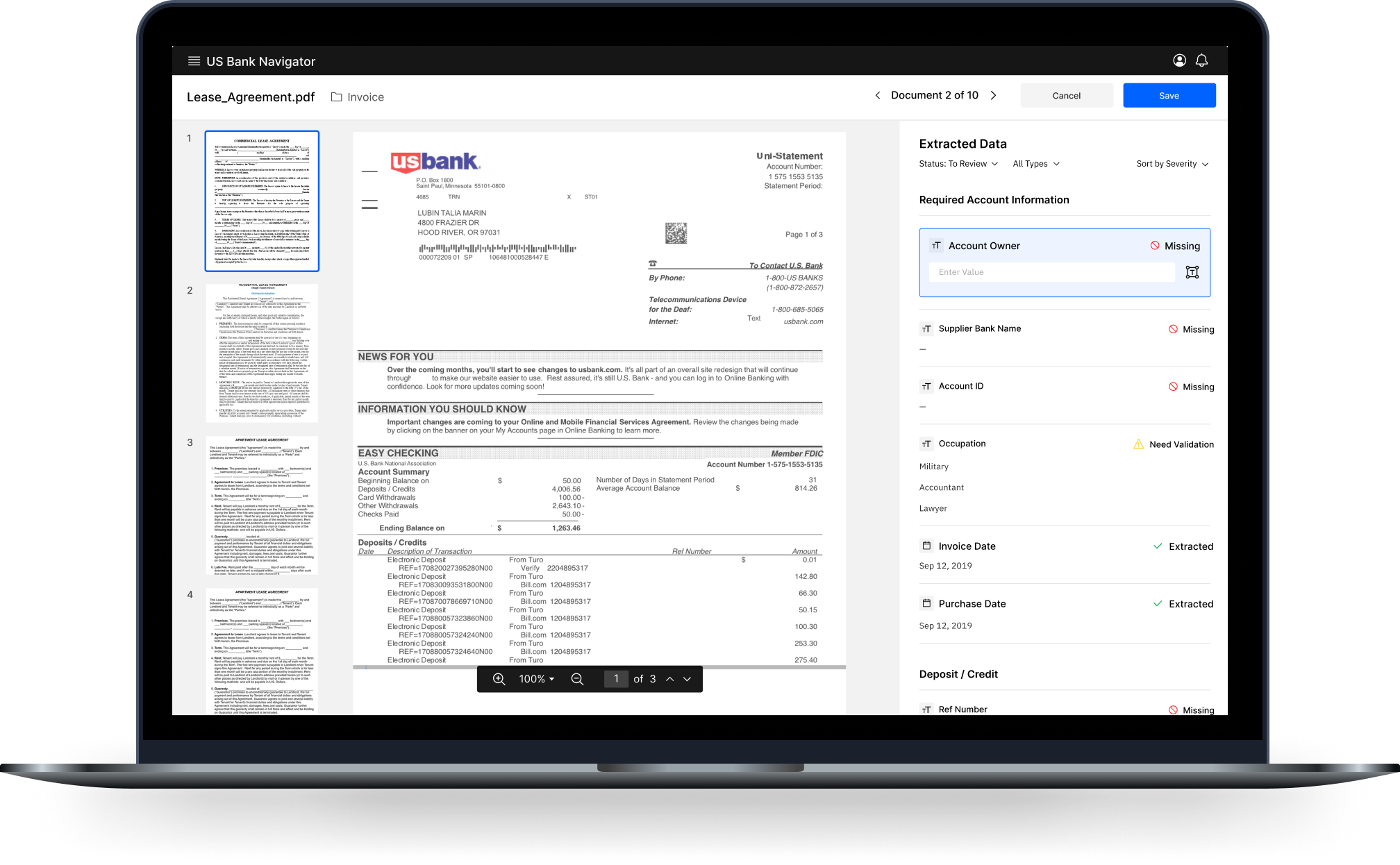
Designing the way to fix extraction data issues
Users need to review and fix errors occurred in data extraction process (data extracted with low confidence, weren’t found on the document or failed validation)
Based on our interviews, I knew people go through a specialized learning process to start verifying extracted data. My goal was to create an interface that will guide and educate users and keep this interface efficient for the pro-users (I defined efficiency as time users spend to solve a problem).
The first version surfaced all extracted fields as one group, and users could easily enter any data. The downfall of this version was that it was hard to scale for complex documents. With many fields, the right panel became hard to scroll, and we needed to add groups for the data.
Extracted data can be diverse (checkboxes, tables). I tried to adjust the existing interface, but design was hard to scale for different data types.

I can do it better
With all controls always exposed to a user, it was hard to keep attention on one field. From the research, I knew accuracy is crucial for users. My idea was to focus the user on one task at a time.
I updated the design, and with new interaction it shows controls only after the user clicks on a field.
I tested designs with usertesting.com and talked with PM and engineering about our problem and its solution, and we included it to the next release.

Results
In June 2020 early adopters started to use this app. Our product improved operators efficiency 4X times.
We worked for eight month together with a product manager, developers teams, research and content designer. A lot of iterations were made and showed to our users to check, can they understand how to navigate and use app, can they use it as fast as they need to accomplish their task.
Preview of the product was showed as part of the bigger product on Think conference 2020.
Project Challenges
The most important part of this project was to understand the content management domain and the users' pain points clearly. It took some time and iterations, and a lot of testing sessions to clearly understand what would be better for them and shape design for their needs and needs of their organizations.
Another challenge was to stay aligned with the other teams. I worked closely with the business team, machine learning and developers team, so I could know what I needed to provide to the teams, so we could move forward as fast as we wanted. Machine learning team mastered the ways to extract new types of fields, and I had to create design ahead of time to bring new features to the app, test new designs, and improve it quickly.
I've learned a lot about content management on Cloud, how organizations manage incoming documents. I also learned a lot about data extraction and how much design and machine learning can do together to improve people's lives.